
🗓️
12–36 months, 37 columns
A classic Saturday-first year grid with context months, ISO week numbers and continuous ribbons across month rows.
A 12–36 month, 37-column planning grid for construction, logistics, staffing and every team that plans a year at a glance.
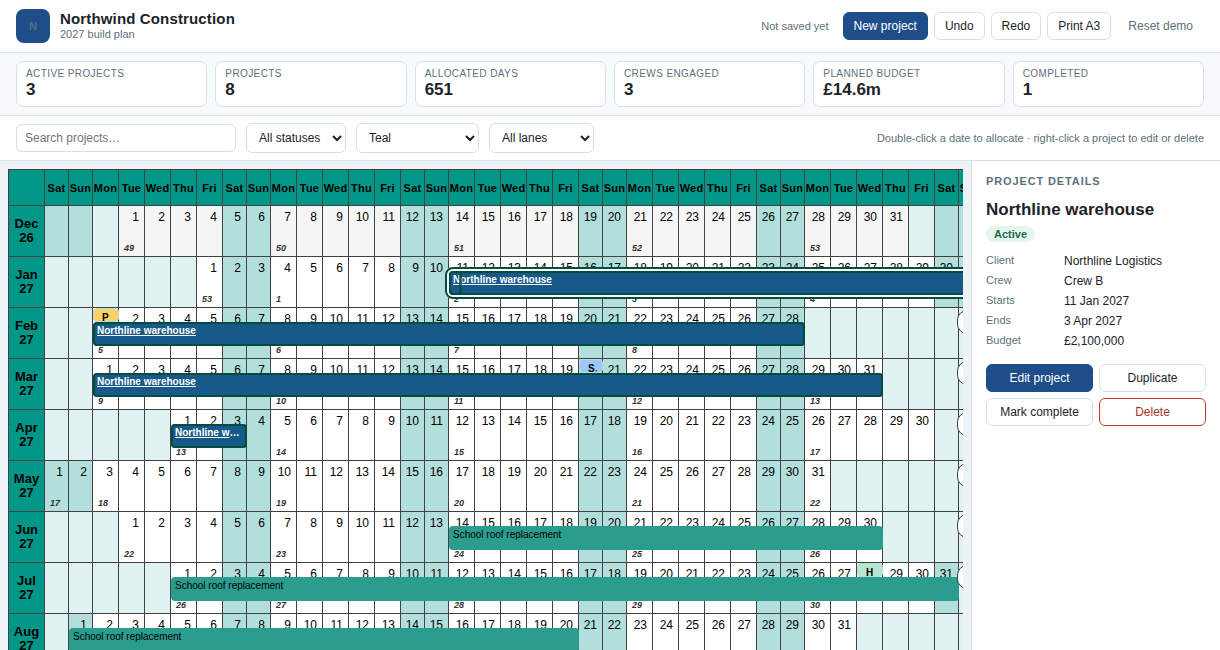
The default 14-month window shows December of the previous year, January to December, and January of the next year. The component can widen to 36 months without changing the renderer: the month rows are data, not a hard-coded calendar.
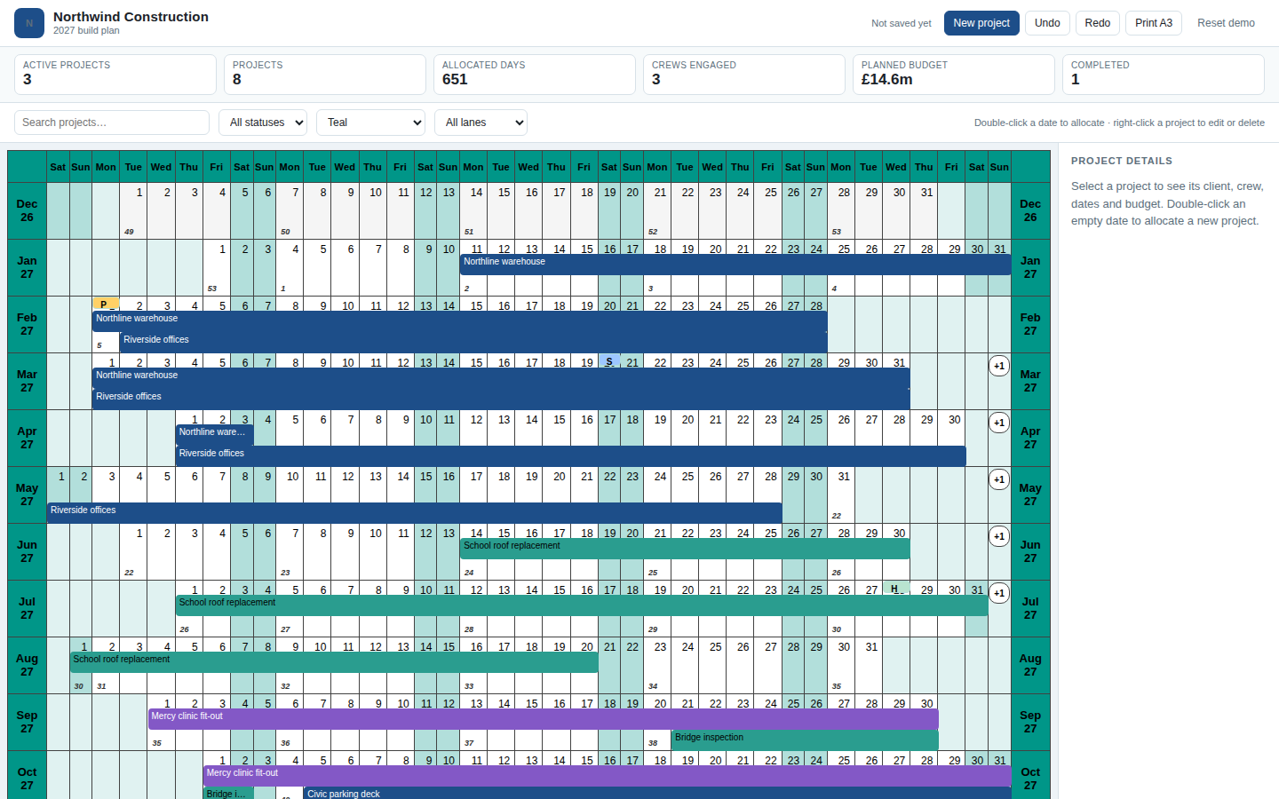
The full construction demo is a working application: double-click a date to allocate a project, right-click a bar to edit or delete it, and reload the page to see the plan restored from browser storage.
import { YearPlanner } from "@blendsdk/react-year-planner";
import "@blendsdk/react-year-planner/styles.css";

const layers = [{ id: "build", name: "Build", channel: "ribbon", color: "#1d4e89" }];
const projects = [
  {
    id: "riverside",
    kind: "activity",
    layerId: "build",
    period: { kind: "all-day", startDate: "2027-02-02", endDateExclusive: "2027-05-28" },
    title: "Riverside offices",
    version: 1,
  },
];

export function Plan() {
  return <YearPlanner year={2027} layers={layers} defaultItems={projects} />;
}pnpm add @blendsdk/react-year-planner. | Start here | What you will find |
|---|---|
| Your first planner | Install the component, add layers and projects, and print the year |
| Controlled commands | Route create, move, resize and delete through a host backend |
| Fit the grid to a host | Measure a bounded region and keep 24 px targets |
| Host-owned context menu | Right-click a date, item or annotation and render your own menu |
| Examples | Live demos, themes, print and design-system adapters |
| Story index | Every story in the built Storybook |
| Storybook | The full interactive component catalogue |
| API reference | Generated TypeDoc for all three packages |
| Localization | 45 locale catalogues and message overrides |