
Themes
The package ships 56 presets: 19 Material 2014 families, 35 Fluent UI v9 families and two monochrome utilities. The planner uses CSS variables, so a host can override one token without forking the stylesheet.
| Group | Presets | Use |
|---|---|---|
| Material 2014 | material-red … material-blue-grey | Familiar Material colour families; material-teal is the default |
| Fluent UI v9 | fluent-red … fluent-anchor | Fluent palette families; fluent-marigold is the print reference |
| Utility | high-contrast | Black, white and grey only, with maximum separation |
| Utility | print | Monochrome screen and print surfaces, print scale 1 |
The complete family list is in the theming reference. Every palette preset uses light surfaces and the same geometry; switching a preset changes colour only. The removed classic-blue, classic-yellow and modern names have no aliases; see Migration.
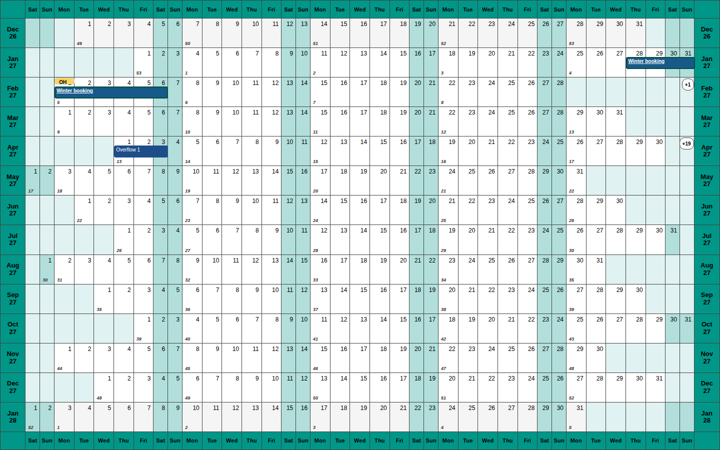
Live theme stories
The Themes story exposes the whole catalogue through its theme control, grouped by Material, Fluent and utility names in the demo selectors.
Token example
const theme = createTheme({
  surface: "#ffffff",
  surfaceMuted: "#f4f7f9",
  ribbon: "#1d4e89",
  highlight: "#f6bd60",
  border: "#424242",
  fontFamily: "Inter, system-ui, sans-serif",
});

<YearPlanner year={2027} display={{ theme }} />;
Contrast
Text, focus rings and meaningful graphical objects meet WCAG 2.2 AA against their backgrounds in every preset. The unit suite measures all 56 presets against every base cell surface. The automated axe matrix covers representative palette and utility themes at the desktop and expanded densities; the manual NVDA/VoiceOver audit is still parked, so the project makes no conformance claim beyond the automated checks.